Chart generators
Explore 88 chart types structured by analytical goal. Edit your data, adjust visual encodings, and export publication-ready SVG, PNG, or Excel data directly from your browser.
What would you like to do today?
Comparison & Ranking
16 chartsUse vertical bar charts for 5–15 discrete items. For long labels or more than 15 items, use horizontal bars or lollipops. Use slope charts to compare rank shifts between two fixed dates.
Bar chart
Compare values across discrete categories with a common baseline.
Generate chartTrack performance
Bullet chart
Show actual performance against a target and a qualitative range.
Generate chartCompare categories
Dot plot
Compare category values with a compact point-based alternative to bars.
Generate chartCompare change
Dumbbell chart
Show the distance between two values for every category.
Generate chartCompare categories
Grouped bar chart
Compare multiple series side by side across the same categories.
Generate chartCompare categories
Horizontal bar chart
Compare categories with room for long labels and direct ranking.
Generate chartComparison
Horizontal stacked bar chart
Compare totals across categories while showing how each component contributes to the total.
Generate chartCompare change
Index chart
Compare relative growth across series by setting all to 100% at a specific start date.
Generate chartCompare categories
Lollipop chart
Combine a thin baseline stem with a dot to emphasize ranked values.
Generate chartCompare categories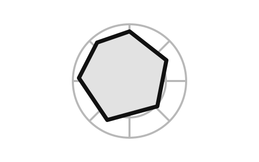
Radial bar chart
Compare values around a circle when a radial presentation adds useful structure.
Generate chartComparison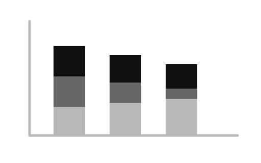
Stacked bar chart
Compare totals while showing how each component contributes to the total.
Generate chartCompare categories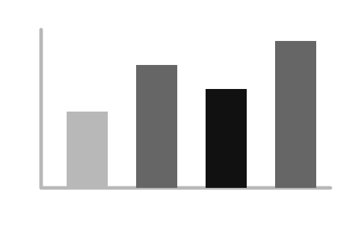
Tornado chart
Compare two opposing metrics, or show the positive and negative impact of inputs on a model.
Generate chartComparison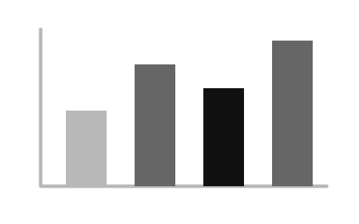
Zoomable bar chart
Explore many categories by zooming into a focused bar-chart window and panning across the full list.
Generate chartExplore data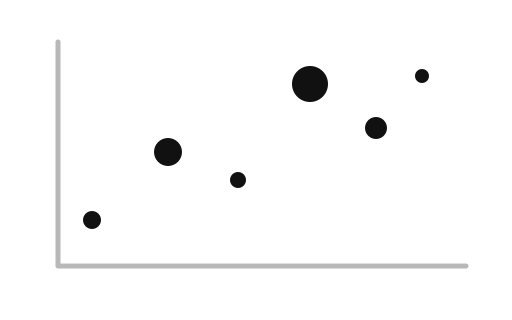
Brushable scatterplot
Select and highlight specific points to filter connected data tables.
Generate chartFind patterns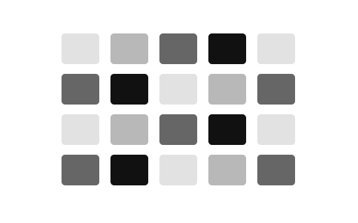
Calendar heatmap
Show daily intensity over a calendar grid to reveal recurring patterns.
Generate chartTime/scheduling
Gantt chart
Plot project tasks over time to show durations, overlaps, and sequences.
Generate chartChange Over Time
13 chartsUse line charts for continuous series with more than 5 periods. Use step charts for discrete rate adjustments and area charts when cumulative magnitude over time matters.
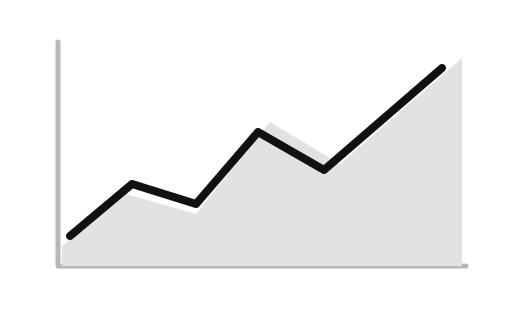
Area chart
Emphasize the magnitude of change and the total across an ordered dimension.
Generate chartTrend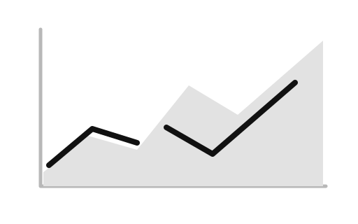
Area chart with missing data
Show changing magnitude over time while preserving visible gaps where observations are unavailable.
Generate chartAnalyze price movement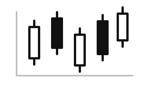
Candlestick chart
Show open, high, low, and close values for a sequence of trading periods.
Generate chartMonitor trends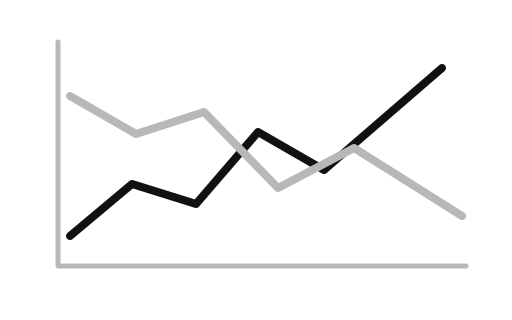
Horizon chart
Compress a long time series into layered bands for compact trend monitoring.
Generate chartChange over time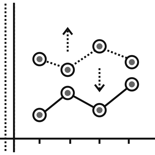
Line chart
Show movement over an ordered or continuous dimension such as time.
Generate chartTrend
Line chart with missing data
Show a time series with honest gaps when observations are unavailable rather than treating missing values as zero.
Generate chartExplain trends
Moving-average chart
Smooth short-term noise while retaining the underlying direction of a time series.
Generate chartCompare trends
Multi-series line chart
Compare several measures over the same ordered time or category axis.
Generate chartTrend
Normalized stacked area chart
Show how category shares change over time while normalizing every period to 100 percent.
Generate chartChange over time
Slope chart
Highlight rank or value changes between two points in time.
Generate chartChange over time
Solar path
Show the path of a sun position across an azimuth-and-altitude view using local synthetic or measured observations.
Generate chartChange over time
Threshold encoding
Mark observations above or below a reference threshold while keeping the underlying trend visible.
Generate chartTrend
Zoomable area chart
Inspect a dense time series with scroll-to-zoom and horizontal panning while preserving the full dataset.
Generate chartPart-to-Whole & Composition
10 chartsUse pie or donut charts only when segment shares are distinct and total ≤5. For multi-level nested hierarchies, choose treemaps, sunbursts, or icicle plots.
100% stacked bar chart
Compare composition while normalizing every category to the same total.
Generate chartComposition
Color schemes
Compare category colors and their relative emphasis before applying a palette to a chart.
Generate chartComposition
Donut chart
Show part-to-whole relationships with a hollow center.
Generate chartComposition
Marimekko chart
Show part-to-whole relationships across two variables where both width and height hold data.
Generate chartComposition
Pie chart
Slice a circle into radial sectors proportional to the data.
Generate chartComposition
Projection comparison
Compare named projections or projection diagnostics on a common horizontal scale before choosing a map treatment.
Generate chartComposition
Radial stacked bar chart
Compare category totals around a circle while preserving each total's component breakdown.
Generate chartExplain composition over time
Stacked area chart
Show how component values contribute to a changing total across an ordered axis.
Generate chartExplain composition over time
Streamgraph
Show changing composition as flowing layers across an ordered time axis.
Generate chartComposition
Word cloud
Show the relative prominence of words or labels with a compact, browser-generated text layout.
Generate chartDistribution & Spread
11 chartsUse histograms to inspect continuous frequency shapes. Use box plots or violin plots when comparing central tendency and quartiles across multiple groups simultaneously.
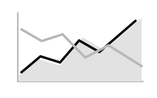
Band chart
Show a central series together with a lower and upper range.
Generate chartExplain distribution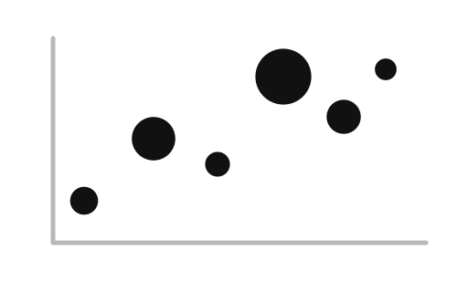
Beeswarm plot
Show every observation while spreading nearby points so distributions remain visible.
Generate chartDistribution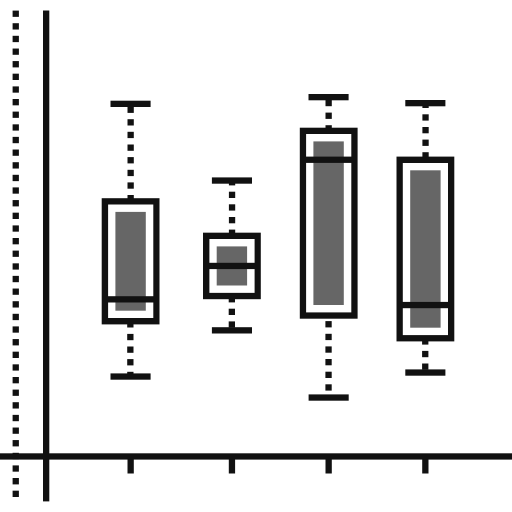
Box plot
Summarize distributions with quartiles, a median, spread, and potential outliers.
Generate chartDistribution
Density contour chart
Show the shape and concentration of a two-dimensional distribution with nested density contours.
Generate chartExplain distribution
Density plot
Compare the shape and concentration of numeric distributions across groups.
Generate chartDistribution
Histogram
Group continuous numeric data into bins to see where values concentrate.
Generate chartDistribution
Local map canvas
Explore country-level values with bundled world geometry and no external map tiles or network requests.
Generate chartTest distribution fit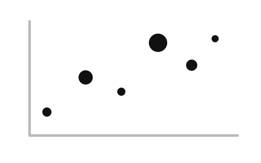
Q–Q plot
Compare observed quantiles with a reference distribution to reveal departures from a model.
Generate chartDistribution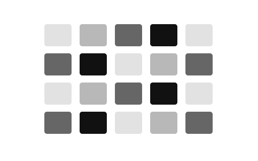
Ridgeline plot
Compare the shape and location of several distributions by stacking compact density profiles.
Generate chartDistribution
Rotatable globe
Inspect bundled world geometry on a rotatable orthographic globe while keeping values and exports local.
Generate chartExplain distribution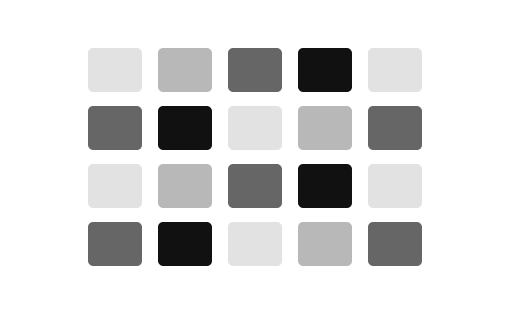
Violin plot
Combine a compact distribution shape with group-level comparison.
Generate chartCorrelation & Relationships
13 chartsUse scatter plots to reveal bivariate correlations and clusters. For high-dimensional data, use scatter matrices, parallel coordinates, or heatmaps.
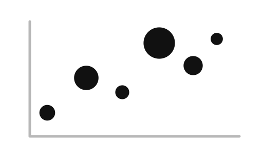
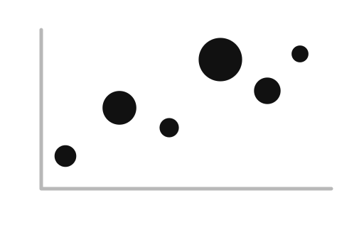
Bubble chart
Compare two numeric dimensions while encoding a third by marker size.
Generate chartRelationship
Connected scatterplot
Follow the evolution of two variables over time as a single connected line.
Generate chartRelationship
Heatmap
Compare values across two categorical dimensions using color and a readable matrix.
Generate chartRelationship
Hexbin chart
Reduce overplotting by grouping nearby points into hexagons whose color represents local density.
Generate chartRelationship
Parallel coordinates
Look for correlations and outliers across multiple variables by connecting rows across vertical axes.
Generate chartSegment options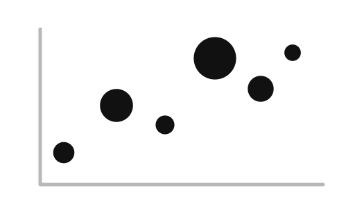
Portfolio bubble chart
Map options across two strategic dimensions while sizing each bubble by importance.
Generate chartSegment options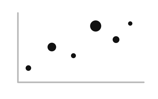
Quadrant chart
Position items against two dimensions and use reference lines to reveal four strategic zones.
Generate chartCompare profiles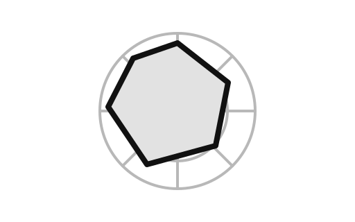
Radar chart
Compare one or more profiles across three or more quantitative variables radiating from a center.
Generate chartCompare profiles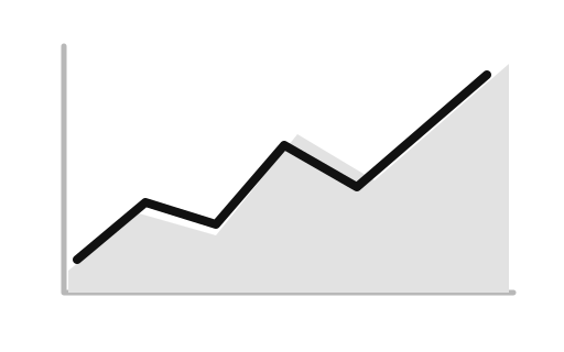
Radial area chart
Compare a multi-dimensional profile around a radial set of axes.
Generate chartRelationship
Scatter plot
Look for relationships between two numeric metrics by plotting them on an X and Y axis.
Generate chartRelationship
Scatterplot matrix
Compare relationships among several numeric measures in one coordinated grid of scatterplots.
Generate chartRelationship
Vector field
Plot direction and magnitude at sampled positions to reveal movement, force, or flow patterns.
Generate chartRelationship
Voronoi diagram
Divide a plane into proximity zones around seed points, mapping geographic influence or creating invisible hit-targets.
Generate chartDeviation & Variance Drivers
5 chartsUse waterfall charts to reconcile sequential budget variances from start to finish. Use diverging bars to highlight positive vs. negative sentiment or metrics around a baseline.
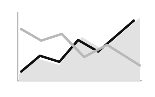
Difference chart
Highlight where two ordered series diverge and which one is larger.
Generate chartExplain direction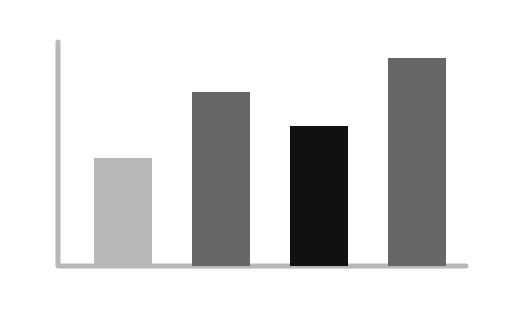
Diverging bar chart
Place positive and negative values on opposite sides of a common zero line.
Generate chartPrioritize drivers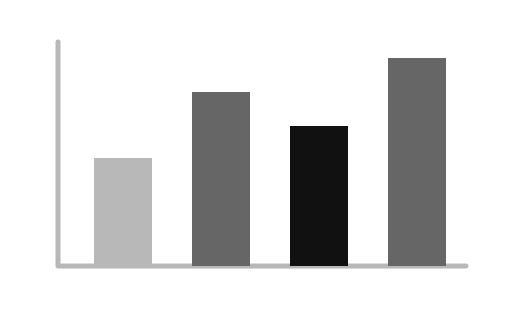
Pareto chart
Rank categories by impact and show the cumulative share of the total.
Generate chartExplain growth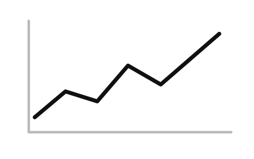
Percent-change chart
Rebase a series to its first observation and show relative percentage change.
Generate chartChange drivers
Waterfall chart
Explain how positive and negative changes move an opening value to an ending total.
Generate chartFlow & Networks
6 chartsUse Sankey diagrams to visualize many-to-many directed volume transfers. Use chord diagrams or arc diagrams for reciprocal inter-category relationships.
Arc diagram
Lay network nodes along a line and connect related pairs with arcs.
Generate chartFlow
Chord diagram
Show complex inter-relationships and bidirectional flows between entities in a circular layout.
Generate chartHierarchy/network
Force-directed graph
Explore connections among entities as a network of nodes and links.
Generate chartFlow/process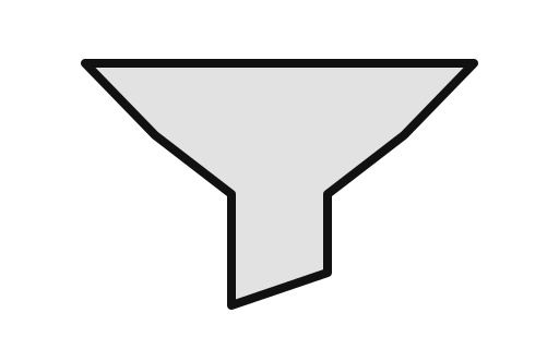
Funnel chart
Show how a population narrows through sequential stages of a process.
Generate chartFlow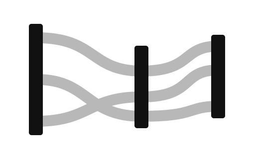
Parallel sets
Compare how categorical groups flow between two dimensions with weighted ribbons.
Generate chartFlow/process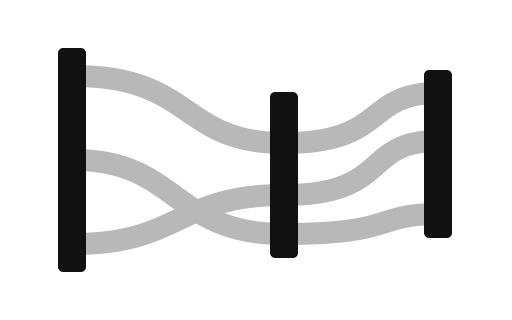
Sankey diagram
Show how quantities flow between stages, categories, or systems.
Generate chartHierarchy & Tree Structures
11 chartsUse indented trees or tidy trees when node names and parentage are primary. Use circle-packing or nested treemaps when relative size dominates.
Circle packing
Show hierarchical items as nested circles sized by their values.
Generate chartHierarchy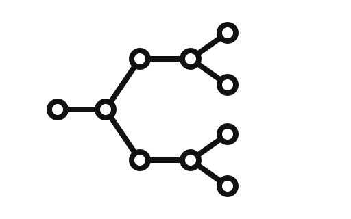
Cluster tree
Arrange a parent-child hierarchy in a compact dendrogram to emphasize related branches and depth.
Generate chartHierarchy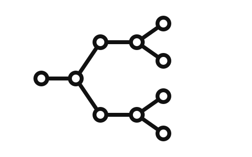
Hierarchical bar chart
Combine parent-child indentation with bars so readers can compare magnitude across a hierarchy.
Generate chartHierarchy
Icicle chart
Reveal a hierarchy as nested horizontal bands whose area represents leaf-level contribution.
Generate chartHierarchyIndented tree
Present parent-child relationships as an indented outline that is easy to scan and export.
Generate chartHierarchy
Nested treemap
Compare hierarchical composition with nested rectangles sized by leaf-level contribution.
Generate chartHierarchy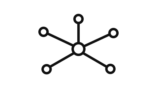
Radial cluster tree
Show a hierarchy as a circular dendrogram when branch structure must fit in a compact footprint.
Generate chartHierarchyRadial tidy tree
Display hierarchical connections radiating from a center root node.
Generate chartExplore hierarchy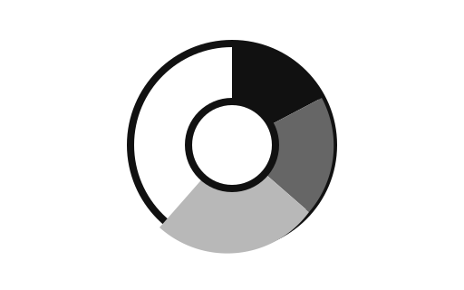
Sunburst chart
Show nested composition as concentric arcs arranged around a hierarchy root.
Generate chartHierarchyTidy tree
Explain parent-child structure with a clean node-link layout and readable labels.
Generate chartHierarchyTreemap
Show hierarchical parts-to-whole relationships as nested rectangles sized by value.
Generate chartSpatial & Geographic
3 chartsUse choropleth maps when geographic patterns correlate with regional administrative boundaries; use bubble maps or dot density when geographic area distorts underlying counts.
Bivariate choropleth
Compare two country-level measures at once with a two-dimensional color scale.
Generate chartGeography
U.S. state choropleth
Compare a value across U.S. states with a color scale over a bundled Census boundary topology.
Generate chartGeography
World choropleth
Compare a value across countries by filling each country with an intensity tied to its data value.
Generate chart