Band chart generator
Skip to the chart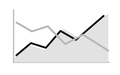
Band chart
Show a central series together with a lower and upper range. Create a private, publication-ready band chart directly in your browser without transmitting sensitive rows off-device. Data is processed locally on your hardware with zero server uploads, enabling instant export to SVG, PNG, and Excel data.
Edit the data, then export.
Everything runs in your browser. Your data is not uploaded.
Data
Paste tab-separated data from Excel or edit the cells directly.
Paste or import table data
Paste a header row, or choose a local CSV/TSV file. Files are read in this browser and capped at 500 rows.
Appearance
Preview
Sample preview of the example data. The live chart takes over as soon as you start working.
SVG, PNG, and Excel exports are generated locally in this browser. PowerPoint export is temporarily unavailable while its dependency path is reviewed for a high-severity image parser advisory.
Statistical Distribution & Shape
A band chart, also known as a range chart or confidence band, plots a central line estimate (like a mean or median) surrounded by a shaded upper and lower envelope. This visual mechanic effectively communicates prediction intervals, margin of error, or historical ranges over a continuous axis (typically time). By rendering both the central tendency and the variance simultaneously, it helps viewers understand the expected bounds of statistical uncertainty. All data processing and rendering happens locally on your device, ensuring your sensitive forecast data is never uploaded to a server.
Data Requirements & Continuous Variables
Format input columns for band chart with explicit headers and numerical measurements. Verify that rows represent discrete categories or observations without unformatted symbol artifacts.
Sample Distribution Data
| Period | Central estimate | Lower bound | Upper bound |
Guidelines for Interpreting Distributions
- Ensure sufficient visual distinction for band chart marks across standard and high-contrast viewports.
- Align text labels horizontally whenever possible to improve cognitive readability for band chart elements.
- Double-check scale boundaries and zero-anchors before exporting band chart presentation artwork.
- Data shape
- Period, value, lower, and upper columns
- Exports
- SVG, PNG, and Excel data; PowerPoint export is temporarily unavailable pending dependency review.
How it works
You edit a table in this page. The renderer draws an SVG from those rows in your browser, then you can download SVG, PNG, or Excel data. The table is not uploaded to any external processing server.
Frequently asked questions
Why are band charts critical in forecasting?
Single-line forecasts convey false precision; band charts honestly communicate statistical uncertainty.
Related tools
Reviewed 16 August 2026.